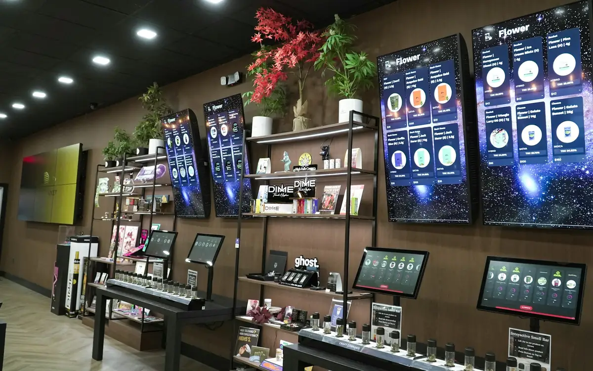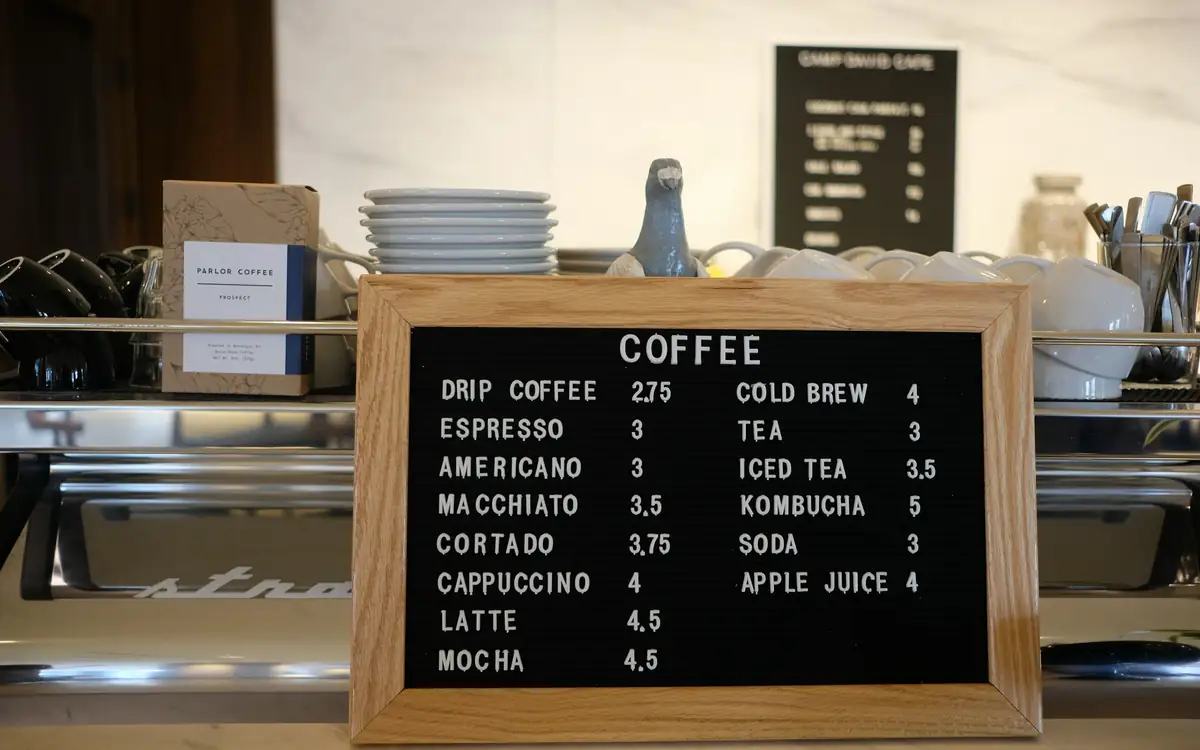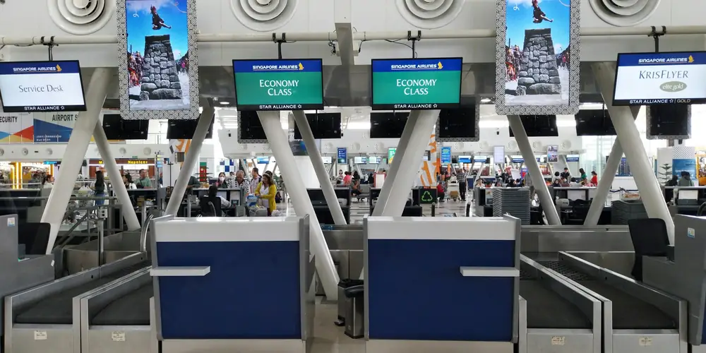
Good digital signage examples have little to do with how impressive the screen looks. They show what the people in front of them need at that moment, and they change when that thing changes: the menu and its prices above a café counter, today's bookings beside a meeting-room door, the next shift on a warehouse wall. Below are ten digital signage examples by setting. Each says where the screen goes, what plays on it, why it works and what to watch out for, and each can be built with an ordinary display, a small player and the apps in a signage system.
What the good examples have in common
Three things show up again and again.
- They start from where people stand and how long they stay. Someone walking past a window gives a screen a glance. Someone in a queue gives it a minute or two. Someone in a waiting room gives it much longer. The content follows from that.
- They show things that change. Prices, bookings, offers, rotas. Information that never changes belongs on a printed sign.
- Each screen has one main job. It can carry a second, smaller message. It cannot carry six.
Digital signage examples by setting
1. Café or bakery: the menu above the counter
A landscape screen above the counter, readable from the back of the queue. At three to five metres, 43" to 55" is the usual size.
On the screen:
- the menu, one category per page, with prices in large type;
- a breakfast board and a lunch board, switched over at 11:00 with a few taps on a phone;
- between the pages, a photo of today's special and a QR code for the guest Wi-Fi.
Why it works: people read the menu while they queue anyway, so a clear board means fewer questions at the till. A price change reaches the wall in seconds instead of waiting for a reprint, and the board keeps playing if the café's internet drops mid-morning.
Watch out for: SignageStack's Menu board app does not sync live from Google Sheets. A menu already in a spreadsheet comes in once as a CSV and is edited in the dashboard after that. A Wi-Fi QR code carries the password, so use it for the guest network only. The guide to digital menu boards goes further.
2. Shop window: one offer, readable from the pavement
A screen behind the glass, facing the street, often in portrait. Here brightness beats size: a bright commercial panel at 43" reads better in daylight than a dim consumer TV at 65".
On the screen:
- this week's offer in a few words, with one strong image;
- a QR code that opens the product in the online shop;
- the opening hours and the web address, for people passing after closing time.
Why it works: people walking past give a window a glance, not a read. One message in large type survives that; five do not. Put the end of the sale in your calendar and switch the offer off on Sunday night. Set the screen's working hours to run past closing time, and the opening hours keep the window useful after the door is locked.
Watch out for: a consumer TV in a sunny window can be close to unreadable at midday. Check the screen at the brightest hour before you buy more of the same model. More in digital signage for retail.
3. Reception: the welcome screen
A landscape screen behind or beside the desk, where visitors look while they wait to be seen.
On the screen, a layout split into panels with the Zones app, and a band running over it:
- a welcome message in one panel;
- today's weather in the other, with the small clock in its corner switched on;
- a ticker along the bottom with the Wi-Fi name and today's notices.
Why it works: visitors often wait a minute or two, and a good reception screen answers the questions they would otherwise ask: where to go, what is on today, how to get online. Everything on it is drawn by the screen itself, so it keeps running if the network drops; the weather simply shows the last forecast it received until the connection returns.
Watch out for: a greeting that names a visitor is read by everyone else in the lobby too. Keep names off the screen unless the visitor has agreed.
4. Meeting room: the bookings by the door
A small screen, often portrait, beside the door of each room, or one screen in the corridor for several rooms.
On the screen:
- the room's Google Calendar in the Schedule view, set to show only upcoming events, so finished meetings drop off;
- for a screen that serves two rooms, each calendar in its own panel with Zones.
Why it works: people stop opening doors to see whether a room is free. The Google Calendar app reads the calendar and picks up new, moved and cancelled bookings on its own.
Watch out for: the screen shows the calendar; it does not take bookings, which are still made in Google Calendar. The app is read-only and shows one calendar per app. If meeting titles are confidential, share only free/busy information with the connected account, and meetings appear as busy without their details. The meeting room display guide covers the setup.
5. Office: the team dashboard on the wall
A large landscape screen where a team sits or walks past: sales, support, operations.
On the screen:
- a table from a Google Sheet with this week's figures, targets or rota;
- a dashboard tool's public share link, shown with the Web page app;
- in between, one item that is not a number: an announcement, a welcome for a new colleague, the next public holiday.
Why it works: the numbers are there whenever someone looks up, without anyone opening a report. The Google Sheets app checks the sheet every minute, so an edit made in the sheet reaches the wall on its own.
Watch out for: a page that needs a login, or that refuses to be embedded, shows blank on a screen; use the tool's public share or embed link. The Sheets app reads the first tab only, columns A to Z and the first 100 rows, and draws its own table, so the sheet's colours and charts do not appear. See office TV dashboards for the details.
6. School corridor: announcements that update themselves
A screen in the main corridor or entrance hall, mounted high enough to be seen over a crowd.
On the screen:
- today's announcements and timetable changes, as short text;
- a countdown to the school play or the start of exams;
- photos of student work;
- the next public holidays.
Why it works: a corridor screen gets glances between lessons, so one short message per slide is the rule. Staff in the office update it from their desks with their own logins and roles, and whoever posts a morning notice switches it off at lunchtime, so it does not linger into the afternoon.
Watch out for: prepare an Emergency Alert in advance. One switch covers every chosen screen within a second, but it is silent, so it supports the fire alarm rather than replacing it. Set working hours so screens go dark overnight. More in digital signage for schools.
7. Clinic waiting room: calm, useful, silent
A screen patients can see from their seats, placed so that nobody has to stare at it from the reception queue.
On the screen:
- practice news: holiday closures, changed opening hours, the dates of the flu vaccination clinic;
- how to book the next appointment, with a QR code to the booking page;
- a QR code that opens the practice's Google review form;
- a patient leaflet as a PDF, turning its pages on its own.
Why it works: people in a waiting room have time and nothing to do, but many are anxious or unwell. Slow, silent, useful content suits them better than fast adverts or a news channel.
Watch out for: never show patient names or anything that identifies someone. Keep items up long enough to read, and be careful with content you do not control. SignageStack's On this day app, for example, takes events straight from Wikipedia, and some dates include wars and disasters. See what to show on a waiting room TV.
8. Gym: timetable on the floor, offers at the desk
Two screens with two jobs: one on the gym floor, one at reception.
On the floor screen:
- today's classes, from the Google Sheet the front desk already keeps;
- a countdown to the end of this month's challenge;
- short motivating quotes, for example from the Daily Wisdom app with its Motivation and Sports topics.
At reception: membership offers with an end date, and a QR code to the class booking page.
Why it works: members on the floor look up between sets; members at the desk have a moment while they wait. Different moments call for different content, so the two screens run different playlists.
Watch out for: YouTube videos and live streams need the internet at play time and are skipped while a screen is offline; for a video that must always play, upload the file instead. If a screen plays music videos or TV channels, the public performance licence is yours to arrange, not the software vendor's.
9. Factory floor or warehouse: news for people without a desk
A large screen where shifts start or cross: the break area, the canteen, the entrance to the floor. At eight metres and more, 75" and up.
On the screen:
- the shift rota and today's priorities, from a Google Sheet;
- safety messages, one per slide;
- the days since the last lost-time accident, with the Countdown app counting up since a date;
- a ticker along the bottom with short notices.
Why it works: many people on a production floor have no company email address, or no time to read one during a shift. A screen where they already stop is how news reaches them.
Watch out for: long distances need large type, so use fewer words per slide than in an office. Run a network cable if you can, because Wi-Fi in a large metal building is often unreliable. The Countdown app counts in days at most, and someone has to reset the date after an accident. More in screens for internal communication.
10. Staff room: the notice board that stays current
A screen in the staff room, back office or kitchen corridor, in place of the cork board with twelve layers of paper.
On the screen:
- this week's rota, as a Google Sheet or a PDF;
- notices from management, each switched off by whoever posted it once it has run its course;
- the fire assembly point and the names of the first aiders;
- birthdays and the next public holidays.
Why it works: a paper notice board fails because nothing is ever taken down. On a digital one, taking a notice down is a switch in the dashboard rather than a trip to the cork board, so agree that whoever posts a notice switches it off when it ends. Several people can post to it, each with their own login. The digital bulletin board guide goes through who posts what.
Watch out for: notices meant for staff should not be on a screen customers can see from the shop floor.
Mistakes that turn up in every setting
- Twelve lines of small text on one slide.
- A loop so long that nobody ever sees the end of it.
- A web page that needs a login, which shows up blank.
- Sound in a waiting room or an open-plan office.
- The same content for six months.
- A screen where nobody looks: too high, round a corner, or at the end of a corridor people walk away from.
Where to start
Pick the example closest to your own space and copy its playlist; most need only three or four items. Build it, set the screen's working hours, and then look at the screen from where people actually stand. If you want more single items to add, the digital signage content ideas are grouped by what you want a screen to do. If you are still deciding whether you need a screen at all, start with what digital signage is.
Every app in these examples is included in SignageStack's plan, and the 21-day trial covers all of them on one screen with no card needed.